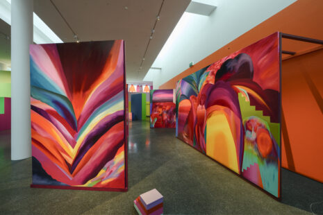
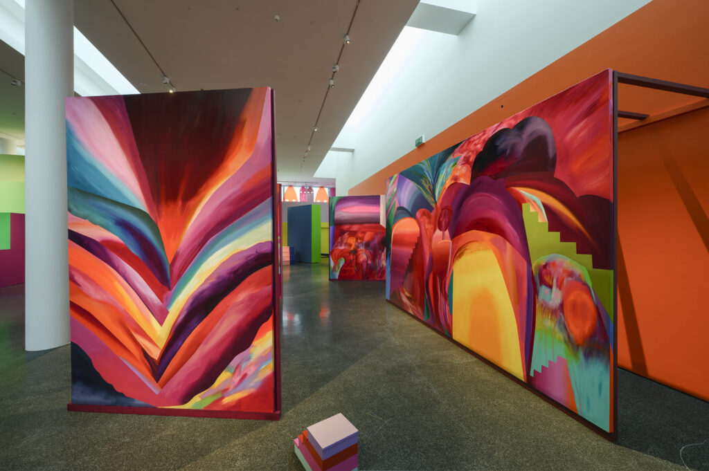
We often describe art as abstract when there is nothing recognisable left to identify: what remains are colour, form, surface and line. But abstraction is not limited to the absence of representation. It can also involve simplifying, fragmenting and reorganising the visible world. In Kongi’s paintings, we encounter stairs, openings, architectural fragments and spaces suggestive of landscapes. Their recognisability does not make the works any less abstract; rather, it raises the question of where the boundary between representation and abstraction actually lies.
A History of Abstraction: Colour as an Autonomous Force
The development of abstract art extends from the abstraction of the visible world through Constructivism, geometric abstraction, Abstract Expressionism, Op and kinetic art, and Minimalism. Nor is abstraction confined to the painted surface: it can operate through installation, sculpture and space. For this reason, perhaps the more interesting question when looking at abstract art is not where representation ends and non-representation begins, but what the artist does with reality.
One of the crucial shifts in early abstraction occurred when colour ceased to function primarily as an attribute of the depicted object. It could instead become a structure in its own right — a means of creating rhythm, depth, movement and emotional tension.
One of the clearest examples is Orphism. Guillaume Apollinaire coined the term in 1912 to describe an abstract tendency emerging from Cubism in which pure colour, light and their rhythmic effects became central. Orphism was often compared to music: just as music does not require a recognisable image in order to affect us, colour and form could generate their own rhythm and intensity. The historical context of Orphism helps explain the technical mechanisms involved — simultaneous contrast, the effects of light, rhythms between colours, optical depth and movement — yet Apollinaire’s comparison with music also suggests that the result cannot be reduced to the sum of these mechanisms. The figure of Orpheus entered the discussion precisely because of music’s abstract and immediate power: colour was expected to operate like sound, without first having to be translated into something else.
Kongi’s Exhibition and Colour
In Kristi Kongi’s exhibition, what registers first is not an image but a temperature. The space is carried by warm reds, crimson, magenta and orange, interrupted by turquoise, green, blue-green and, at times, cooler violet. It is precisely this tension between warm and cool that seems to set the surfaces in motion: warm colours appear to advance towards the viewer, cooler ones recede into depth, and then the direction shifts again. The eye is never allowed to settle on a single plane.
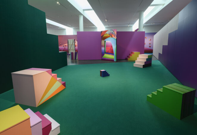
Only after this initial impact of colour do the stairs, spaces, landscape-like forms with blue pools, vegetation and architectural fragments begin to emerge. They are entirely recognisable, yet alongside them colour, rhythm, scale, repetition, direction and spatial effect become equally important.
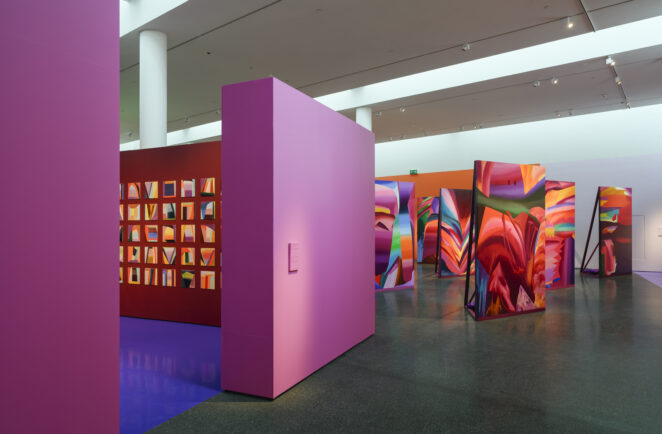
Wassily Kandinsky’s theory of colour offers one historical point of comparison. For Kandinsky, colour was not a passive attribute but an active force in its own right: warm red was active and intense, yellow projected outwards, while blue receded and created depth. In Kongi’s exhibition, it is useful to consider these ideas not as a dictionary of symbols but in terms of spatial effects. Reds and magentas do not remain contained within the paintings; they recur across large surfaces, walls and reflections on the floor, making the entire space feel warm, dense and almost bodily. Blue, turquoise and blue-green areas appear more sparingly, but for precisely that reason they function as powerful interruptions and points of depth: a vivid turquoise within a field of red and magenta can suddenly seem to open up the surface.
Kongi’s colours cannot, however, be contained within any single theory. She has described colour as a “storyteller” and has said that every painting has its own sense of time, determined by the tones chosen for it. She has described pink as an “empathetic and supportive” colour, yet in the exhibition it does not always feel soft. Alongside red and magenta, it can become almost electric, tense and sharp. This makes clear that the effect of colour does not arise from an individual hue in isolation, but from the colours and forms it encounters and the space it creates around itself.
Curator Ann Mirjam Vaikla has described the exhibition’s darker shades of violet, brown and burgundy as “burning landscapes”, connecting them to the anxieties of the Anthropocene. Kongi’s own position, however, is less sombre. She has emphasised that she is optimistic by nature and does not wish to abandon that position; even when the creative process moves into a darker register, she retains a desire to return to something more open and luminous. The overall impression of the exhibition is therefore warmer and more inviting than catastrophic.
When standing in front of Kongi’s paintings, these theories are worth keeping in mind not as a ready-made key to interpretation, but as a way of seeing more. One can begin with colour as an experiment in perception: what comes forward, what recedes, where does surface become depth, and how does one colour change beside another? From there, motifs and symbols can gradually emerge, creating new relationships with colour and space. The work reveals itself in layers rather than yielding a single correct answer.
Exhibition Design
The exhibition design is multilayered without becoming an effect detached from the paintings. On the contrary, it allows Kongi’s paintings to continue unfolding into the surrounding space. Exhibition designers Mari Hunt and Grete Daut of the architecture studio MARIHUNT, together with curator Ann Mirjam Vaikla, have worked with the artist to create an environment that is not a neutral backdrop for the paintings but actively shapes the way they are experienced.
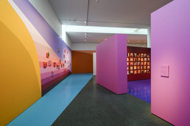
In Kongi’s own practice, the coloured environment is a natural extension of her work. A different question arises when the same approach is used in exhibitions by other artists. Kongi has designed a number of exhibitions in recent years, often employing strong colour contrasts. More broadly, both in Estonia and elsewhere, exhibition design increasingly tends to introduce wall colour, architectural structures and other spatial interventions as an independent visual layer. This can strengthen an exhibition, but it can also reach a point where the design begins to compete with the artworks for attention.
The First Woman Artist to Have a Solo Exhibition in Kumu’s Great Hall
Kumu’s Great Hall is rarely used for newly commissioned projects conceived specifically for the space. Since the museum opened in 2006, there have been only a handful of solo projects on this scale: Jaan Toomik in 2007, Kaido Ole in 2012, and now Kristi Kongi.
In 2023, the Great Hall hosted Through the Black Gorge of Your Eyes, a group exhibition bringing together works from the 1960s to the 1980s by women graphic artists including Concordia Klar, Silvi Liiva, Marju Mutsu and Naima Neidre. Kumu itself described the exhibition as the first time the Great Hall had given women artists’ work space “on such a scale”. In other words, the 2023 exhibition marked the first time women artists’ work had occupied the Great Hall to this extent.
Twenty years, and before Kongi only two solo projects of this scale, both by male artists — why did it take the institution two decades to arrive at a solo presentation of a woman artist on this scale, and why was Kristi Kongi the first?
Kumu director Kadi Polli has emphasised that Kongi was expected to create more than a conventional display of paintings: the museum was looking for an artist capable of thinking across the entire Great Hall and creating an environment that would encompass the space as a whole. Kongi’s background in monumental painting and her established practice of bringing painting, colour, light and architecture together support this approach. She also has extensive experience as an exhibition designer, meaning that space is not simply a backdrop for her work but an active part of her artistic thinking.
From Knowledge Back to Experience
Knowing the history of abstract art does not provide a single correct interpretation of Kristi Kongi’s Chromatic Drift, but it does offer more ways of seeing. Understanding how abstraction developed from the simplification of the visible world towards autonomous colour, rhythm and space helps us notice why one hue changes beside another, how colour creates depth and movement, and why a staircase, an opening or a landscape-like fragment does not necessarily make a work any less abstract.
Just as we can recognise an instrument, rhythm or harmony in music without believing that describing these elements exhausts the experience of the work, Kongi’s paintings cannot be reduced to a sum of colour contrasts, compositional devices and art-historical parallels. Such knowledge can sharpen our perception, but it should not take away the possibility of simply looking and experiencing.
Kongi herself has stressed that colour theory is not a formula she consciously applies and that not everything needs to be explained to the viewer in advance. This is particularly relevant to Chromatic Drift: the more time one spends in the exhibition, the more the relationships between colour, space and form begin to unfold. Ultimately, however, the work operates on a level that resists being fully translated into words — as with any good work of art, its emotional and bodily experience is greater than the sum of its individual parts.
Kristi Kongi’s Chromatic Drift is on view in the Great Hall and courtyard of Kumu Art Museum until 11 October 2026.