Linas Spurga Jr.: “I have been doing calligraphy for a long time, but I couldn’t define it exactly. Is calligraphy simply the art of beautiful writing or writing with a feather pen, or is it a higher form of handwriting or writing as art? I see flaws in all the definitions, but I draw from all of them to create my own one.
I formulate this definition by practically rethinking the laws of classical, formal calligraphy, by using unusual and digital writing tools, and thus creating calligraphic works made of shapes of letters that I have never seen myself before. In my opinion calligraphy, unlike typography, is closely related to impermanence, when even the most carefully created letters are never copies of each other. In my work, I have turned this insight into a principle: instead of striving for an ideal script, I allow the fallibility encoded in the movements of my writing to unfold, emphasizing and highlighting the uniqueness of each letter.
These searches and experiments are united by almost manic desire to write letters. As I write, I consider how letters should be transformed to make them unreadable but still recognisable as letters; and whether a letter that no longer resembles a letter is still a letter; how important is text in calligraphy; what a blackletter Fraktur script would look like if it were bound like sausages; what Lombardic capitals would look like if medieval monks were graffiti masters. One question poses another, the answers are unsatisfactory, while a reproduction of Gutenberg, hanging on the wall, stares at me with a raised eyebrow.
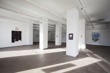
Calligraphy used to have a very clear applied function, but nowadays it is free to be anything. This freedom gives room for diversity and unseen point of view, but it also creates uncertainty in the attempt to define calligraphy. This exhibition is my definition, which it is not completely precise, incomplete, open to questions and reflections.”
Linas Spurga Jr. is a calligrapher, graphic designer and lecturer, who graduated from the Department of Graphic Arts in Vilnius Academy of Arts. He created calligraphies for the HBO television series “Catherine the Great” (2018) and for the MO Museum’s major exhibition “Why Is It Hard to Love?” (curators: Saskia Boddeke and Peter Greenaway, 2020). He has also had solo exhibitions in Vilnius (2018) and Klaipėda (2022). In 2022, he was included in the Homo Faber Guide, which is dedicated to promote artisanal arts. In the field of graphic design, he has created visual identity for the Druskininkai Poetic Fall, Skalvija Cinema Centre and Meno Avilys events; he designs book covers for the RARA publishing house, and also works in the field of typeface design. From 2017 to 2022, he worked at Vilnius College of Design as a lecturer in Typography and Type Design. Since 2015 he has been running calligraphy workshops, in 2019-2020 he has been teaching weekly calligraphy courses “Dash”, and since 2021 he has been giving classes at The School of Calligraphy and Lettering Art in Klaipėda.
Organiser: Pamėnkalnio Gallery.
Sponsors: Lithuanian Council for Culture, Lithuanian Artists’ Association.


